Understanding Histograms, Mean & Standard Deviation in Drone Mapping & 3D Point Cloud Analysis

Understanding Histograms, Mean & Standard Deviation in Drone Mapping & 3D Point Cloud Analysis

Statistics are the mathematical backbone of wildlife conservation and ecology. They allow researchers to estimate population sizes, track migration patterns, understand animal behaviour, and evaluate the impacts of environmental changes or human activity on ecosystems. Here is how key statistical concepts are used in the field, followed by an explanation of the mean and standard deviation.

How Statistics are used in Wildlife

  • Population Estimation: Instead of counting every single animal (which is usually impossible), biologist’s use statistical sampling and capture-mark-recapture models to accurately estimate total population sizes.
  • Habitat Modelling: Researchers use statistical regression to analyse environmental variables (like temperature, vegetation, and water proximity) to predict where specific species are most likely to live or roam.
  • Conservation Monitoring: Statistical tests help determine if a population is growing, shrinking, or staying stable over time, and whether conservation efforts (like anti-poaching patrols) are actually working.

1. Mean

The mean, commonly known as the average, is the central value of a data set.

  • How it works: You find the mean by adding all the numbers in your data set together and dividing by the total count of those numbers.
  • Wildlife example: If you record the number of eggs laid in 5 different sea turtle nests, let’s say nest 1 = 105 eggs, nest 2 = 110 eggs, nest 3 = 98 eggs, nest 4 = 115 eggs and nest 5 = 102 eggs. We add the number of egg and divide by the number of nests: (105+110+98+115+102)/5 = 106 eggs. The Mean or average number of eggs is 106.

2. Standard Deviation

The standard deviation measures the amount of variation or “spread” in a set of data.

  • Low standard deviation: The data points are clustered closely around the mean (most numbers are very similar).
  • High standard deviation: The data points are spread out over a wide range of values (the numbers are very different from one another).

Wildlife example: The sample standard deviation for this data is 6.67 eggs (rounded to two decimal places).

In wildlife biology, we use the sample standard deviation because we are looking at a small subset (5 nests) instead of every sea turtle nest on Earth.

Step-by-Step Calculation

Here is exactly how that number is calculated:

  1. Find the mean: The mean is 106 eggs, as calculated before.
  2. Subtract the mean from each number of eggs in the nest to find the deviation for each nest:
    • 105 – 106 = -1
    • 110 – 106 = 4
    • 98 – 106 = -8
    • 115 – 106 = 9
    • 102 – 106 = -4
  3. Square each of those deviations (to remove negative numbers):
    • (-1)2 = 1
    • (4) 2 = 16
    • (-8) 2 = 64
    • (9) 2 = 8
    • (-4) 2 = 16
  4. Sum the squared values: 1 + 16 + 64 + 81 + 16 = 178
  5. Divide by n – 1 where n is the number of samples, so 5 – 1 = 4:
    • 178/4 = 44.5*
  6. Take the square root of that result (return the number to its original unit of measurement after square of deviations which removed negatives):
    • √44.5 = ±6.67
*Why n -1 and not just n?

Our Standard deviation (spread) either side (±) of the mean (average) is 6.67 eggs. We subtract 1 from the number of samples—a correction known as Bessel’s Correction—to account for the fact that a small sample usually underestimates the true variation of the entire population.

Here is exactly why this mathematical adjustment is necessary.

  1. Samples Tend to Underestimate Variation

When you collect a small sample (like 5 turtle nests), the animals or nests you measure are highly likely to come from the main, average part of the population.

You are very unlikely to accidentally pick the absolute extremes—such as the single largest or single smallest turtle nest on the entire beach. Because your sample lacks these rare extremes, the raw spread of your data looks smaller than it actually is in the wild.

  1. The Role of the Sample Mean

To calculate standard deviation, you must first calculate the sample mean (106 eggs).

Because that mean is generated from your 5 sample nests, the data points are mathematically closer to their own sample mean than they would be to the true, unknown mean of all millions of turtle nests on Earth.

If you divide by just n, you get a biased result that falsely suggests your data is more tightly clustered than it really is. Dividing by n-1 makes the denominator smaller, which mathematically inflates the standard deviation just enough to correct this bias.

  1. Degrees of Freedom

In statistics, this concept is called degrees of freedom.

Imagine you have 5 data points, and you already know their mean is 106.

  • The first 4 nests can have any number of eggs imaginable (they are free to vary).
  • However, once those first 4 numbers are locked in, the 5th nest has to be a specific number to make the average come out to exactly 106.

Therefore, only n-1 (4 out of 5) of your data points are truly free to vary. The last data point holds no new informational value regarding variation.

Sample vs. Population

Biologists use two different formulas depending on what they are studying:

  • Use n-1 (Sample): When you look at a subset of a group (e.g., 5 nests to estimate the whole beach). This is almost always used in wildlife biology.
  • Use n (Population): Only when you have counted literally every single individual in existence (e.g., if there are only 5 Kakapo parrots left in a specific sanctuary and you measured all 5).

3. Histograms

A histogram is a graph that shows how frequently different values occur in a dataset.

The x-axis represents the measured values, while the y-axis shows how many observations fall within each range of values.

Histograms are powerful because they reveal the shape of a dataset. While the mean tells us the average and the standard deviation tells us the spread, a histogram shows whether the data are evenly distributed or influenced by a small number of unusually large or small values.

The Significance of Statistics & drone data for vegetation recovery monitoring

Now let’s have a look at what this means with regards to drone data. A site was cleared of sensitive fynbos vegetation for construction. After clearing, the site was scanned using a DJI Phantom 4 Pro V2 and the image data proceeded in WebODM into high resolution maps and 3D point clouds. Construction of the site was put on hold indefinitely and therefore the fynbos had time to recover. 15 months later the site was scanned again in the exact same manner and the data aligned with the first data set and processed in WebODM.

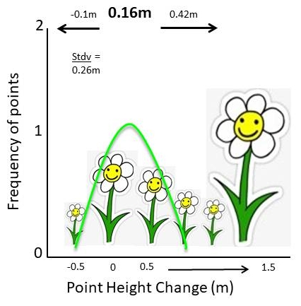
The two 3D point clouds were then analysed using Cloud Compares M3C2 tool to detect the change in vegetation over the site over the 15 month recovery period. The resulting stats showed a mean of 16cm and a standard deviation of 26cm. The standard deviation is larger than the mean itself, indicating substantial variation in vegetation growth across the site. But the resulting histogram shows us why. The overall recovery (vegetation growth) was generally small and uniform, but there were a few species that grew much taller, much faster over that time. This makes a lot of sense as there were a small number of invasive alien plants (Acacia mearnsii) as well as a small number of fast growing pioneer plants (Osteospermum moniliferum) that grew up to 1.5 metres over that time. Most of the site came up with smaller species such as Erica bicolour and the like.

Image 1: The histogram generated from the M3C2 change between data set 1 and 2. Count is the number of points in the point cloud and M3C2 distance is how many metres the points have changed between the two point clouds ove the 15 month period. Note the long tail to the right and the small increase in the number points measuring 1.3 to 1.5 metres. These likely represent the small number of fast-growing plants detected in the survey. There is a small number of points that shift towards the negative, this is most likely due to compaction and break down of sticks and rotting stumps.

Conclusion

A drone survey is far more than a collection of aerial photographs and attractive 3D models. When combined with statistical analysis and change detection tools such as M3C2, those datasets become powerful scientific records. They allow us to quantify ecological recovery, identify unusual patterns of growth, and monitor environmental change with a level of detail that would be difficult to achieve through traditional field methods alone. Understanding the statistics behind the data is what transforms a beautiful map into meaningful ecological insight. 

Why I still use the DJI Phantom 4 Pro V2 in 2026

Why I still use the DJI Phantom 4 Pro V2 in 2026

I started out my drone journey using the DJI Spark. Bought while working on farms in Australia to film and photograph my adventures in the beautiful Aussie Outback, I never thought this compact little pocket sized bumble bee would be the start of a career shift into all things computers, drones and fancy pants software some two years later. At the time I was a bush baby, a farm lad if you will, lover of open spaces and working with my hands and therefore a “technophobe”. The mere thought of a computer being used for anything other than watching a film or documentary was a total waste of time. I mean, you can’t go wrong with a pen and paper right? Even opening a Word document made me want to regurgitate my breakfast onto the keyboard!

Well that all changed in 2019 didn’t it?! Upon discovering the world of photogrammetry at a drone workshop hosted by a CAA registered drone pilot licensing outfit, my mind was completely blown and my outlook on all things tech-related changed completely! Laptops and computers were no longer these annoying devices that scrambled your Word document when trying to change a heading, or a stupid thing that pinged at you when something on the clipboard didn’t fit the requirements for Excel for no apparent reason. Now they were actual tools, with software I could get behind. I just had to learn it all…from scratch…without any assistance.

The world soon went mad and fell on its arse when 2020 hit and that actually gave me the time I needed to take a deep dive into all things drones, photogrammetry and GIS. I was OBSESSED! The more I researched drone hardware, photogrammetry software and GIS applications the more I thought “well there seems to be no end to what you can apply these tools to. If this is what people use the software for regarding satellite data analysis, then up-to-date high res drone data is a whole other universe that can be tapped into!” So I started looking for drone GIS-related stuff on the internet and the results were very few and far between. There was loads of stuff about photogrammetry software like Pix4D, Drone Deploy and the big players, but nothing about actual geographic information systems software (GIS) analysis of drone data. It was up to me to figure it out the old school way with good old trial and error. Man did that little Spark fly, I mean A LOT!

I learned everything I could about the Spark and tested everything practically; image overlaps, flight altitudes, flight speeds, camera settings, gimbal angles, flight patterns, nadir mapping missions, cross hatch missions, 3D modelling missions and did this for the millions of drone mapping applications that I could think of across different fields (but primarily in conservation as that is my background). I maxed out so many 1-month free trials, using different email addresses for photogrammetry software platforms that allowed them at the time, that I have lost count. That Spark taught me the basics and the more advanced stuff too. I have a soft spot for the wee quadcopter. So much so that it now sits on my desk next to me as I type this, its tired batteries unable to hold a charge for more than 5 minutes, scars incurred from countless small crashes, its long front sensor ever watchful, ever ready for one last flight. A retired veteran of the skies and a reminder of all the lessons learned that got me to this point. What a wonderful piece of technology.

When the world started to open up again and the madness subsided (in 2021, 1.5 years later in my country), the prospect of droning for conservation and other fields was becoming a more serious consideration and Sparky was not only worn out, but was also not the right tool for the job(s). Even if she was in full health regarding batteries etc, her limitations for serious work were already obvious. The flight time limited the area she could cover at any given time, her light weight frame could only withstand moderate winds, her 12MP rolling shutter camera was not quite up to the job and DJI had limited the on-board GPS metadata stamping to the images to only 4 decimal places which meant that the maps rendered in photogrammetry software were so far off the mark that even ground control points (GCPs) could not correct the georeferenced error.

Time for an upgrade then. And there was a clear winner at the time; the DJI Phantom 4. Everything I listened to, read about, watched and digested from hundreds of billions of podcasts, articles and YouTube videos all said that this drone was the best all-rounder for photography, videography, mapping and modelling. Some experts at the time even went as far as to say that the drone would be the workhorse of the decade and maybe longer. Funny, they weren’t wrong!  I was lucky enough to find the Pro V2 which was the latest version of the drone at the time (production had stopped in 2019 due to upgrades to hardware frames, the compact Mavic frame taking the place of the chunkier Phantom range. Steady advances made to hardware and software allowing drones to become more compact).

The Phantom 4 range, in particular the Phantom 4 Pro V2, is still my work horse for many projects in 2026 and there are a number of good reasons why:

  1. It works perfectly well! So why would I get rid of it? Many folks may say, “Well you have to keep up with the times”. I don’t agree in this case; the drone still flies, still works with my mission planner apps and captures exceptional image data and the batteries are still good, even though they are old.
  2. The 1-inch CMOS 20MP camera sensor allows for incredible stills image detail and fabulous RGB colour capture which is perfect for not only mapping, but professional photography as well in JPEG and DNG (RAW). Video is up in 4k, 60 frames per second for epic scenic or action shots.
  3. The mechanical shutter stops movement in images dead in their tracks. A rolling shutter causes a rolling (warping) effect in the image and this does have an effect on your photogrammetry outputs even though most photogrammetry software nowadays does compensate for rolling shutter. Remember, your subject may be moving slightly in the wind and the drone is moving while mapping as well so stopping everything dead rather than having a warped effect is ALWAYS better (see Foundation Course for more). Most of the newer drones come with rolling shutters and mechanical shutters are only available on very expensive enterprise models.
  4. Epic obstacle avoidance. The sensors, although admittedly not as good as their newer counterparts, are still excellent and stop or avoid obstacles very well.
  5. Being an older drone it is 3rd party app friendly so when it comes to mission planner apps, you have a wide choice. Many modern drones will only run using the flight planners made for that model and the software comes with an annual subscription fee so even though you have spent billions on the latest drone, you still don’t get free software with it (mostly in the enterprise range of DJI drones including the Agras range).
  6. The OcuSync 2.0 C2 link transmission is still very, very good! The picture is clear, the telemetry display is grand and it works very well indeed for my needs even at range.
  7. It is solid in the air and flies steady in stronger wind conditions.
  8. You can still buy them for a good price second hand and if they have been looked after and the battery maintenance kept up the drone will go a long way! They are affordable.
  9. When ground control points (GCPs) are used, georeferenced accuracy is still survey grade; however it does require extra steps compared to modern RTK drones. But even RTK drones benefit from the addition of GCPs.

I could go on but I think I have made my point in terms of the pros. But there are some cons and as with any good reasoning, these have to be considered too:

  1. The support services for these drones are, as of 2023 no longer available. That means major software and firmware improvements will no longer be conducted. However minor mandatory compliance updates will continue.
  2. Spare parts are no longer produced. However, these drones were incredibly popular so you can still get spares.
  3. This might be the big one for the future. Three of my 5 batteries are still good and I can still get about 16 – 20 mins out of them before landing between 20 and 30% (never go below 20% battery use!! It will kill your batteries faster and if you are a commercial pilot, you may have to file an emergency report). So that’s still around the flight time of the battery when the drone came out. The other two still last for about 15 minute a piece which is still very impressive considering the amount of flying the drone has done. Battery maintenance is critical with older drones. Problem is, I won’t be able to get more when these eventually die.
  4. It is not as compact as the modern drones which make it more cumbersome to take around in the bush when mapping remote areas.
  5. It is loud! Compared to modern airframes the Phantom is a loud drone, this is not ideal when mapping sensitive species or flying in areas where you want to keep noise to a minimum. They really piss off elephants!

Other than these, the notion still stands. The DJI Phantom 4 Pro V2 was and still is a fabulous piece of kit and in my mind still relevant in 2026. And you must admit, whenever you see a sign depicting drone operations, drone sales, “no drone zones” or anything to do with flying robots, the silhouette is usually that unmistakable frame.

Fast Preliminary 3D Models & Reports for Dam Site Surveys

Fast Preliminary 3D Models & Reports for Dam Site Surveys

In the past I did a number of preliminary dam site survey scans for the local municipality. At the time they were looking to construct new dams for farmers that were expanding due to population increase to the region; more people= more crops = more water. I would generate the usual; contour maps from drone DTMs and did some basic analysis of the site.

I always knew that there was more that could be done for the client with the drone data in GIS but I wasn’t exactly sure what. I then decided to look at the big picture and what questions needed to be answered in the preliminary stages of looking for dam sites.

The client would need to know things like; “how much water would this site hold if the wall was built there, what would the wall dimensions need to be if it is a cement or earth dam, how much material will be needed to construct the wall, what are the depths?” And so fourth.

Open source software allowed me to construct virtual dams extremely quickly with answers to all of those questions. See the short video below (the entire workflow run time shown here runs in real time; 6.97 seconds) and have a look at the sample PDF here. It would be great to have your feedback on this type of workflow.

Let your own creativity fly

Let your own creativity fly

“So here’s a thought, what is the point of learning open source? Why not just do an ESRI or ArcGIS course?” I found myself asking myself a number of years ago before I went face first, full tilt down the open source software rabbit hole. This was long before I had even thought of starting GeoWing Academy, before I knew how to properly capture data with flying robots. I had no idea just how much more information was hiding in those images — far beyond the usual mining or agriculture outputs that the big proprietary platforms like to showcase.

And that is still a great question, why learn open source? Most of the stuff I could find online was about proprietary photogrammetry software and GIS software. I used the trial periods provided by the platforms that allow you to use the software for free to get an idea of it and learned what I could but was always left wondering, “well that’s cool and all but I want to do X, Y and Z”. Initially I thought I was asking too much of the software and thought that I was probably not going to be able to do what I wanted with the software, particularly with regards to the complex nature conservation applications I had in mind. But as with everyone around the world at the time, I had time on my hands loads and loads of time. I was bored of Netflix by day two of the global lockdowns and could feel my brain turning to snot. So I returned to the drone data analysis questions I had and slowly started to realise that what I wanted to do was possible, but needed a deeper understanding of how both data collection, photogrammetry and geospatial software worked and how they fitted together. Then, along came open source!

Image 1: It is important to understand why and how to calculate the Ground Sampling Distance (GSD) for your data capture needs. The size of your pixels will determine your ability to correctly analyse your data in GIS down the line. Foundation Course Part 2 classroom snapshot

Image 2: GeoWing Academy teaches you how to use flight mission planning apps to capture data correctly. This is a snapshot from the classroom in the Foundation Course Part 2

This was it, the software platforms I needed, customisable, loads of information and forums to query things on and the ability to trial and error methods over and over until I got it right without the massive cost incursions and restricted creative space provided by the former software platforms.

But eish, everything online was based around satellite data, the big stuff. I found some extremely useful items about drone data analysis but the majority of what I wanted to do was still out of reach. So through hundreds if not thousands of drone flights, photogrammetry processing over and over and learning how to use the insane tools in open source for analysis from any scientific papers and tutorials on satellite and high resolution aerial data analysis and through countless hours of trial and error, tweaking and adjusting settings etc, I was finally starting to get somewhere. Now, I can bring that knowledge to you without you having to go through years of the same. FAST!

Image 3: Snapshot from GeoWing Academy Intermediate Course Part 1. High resolution drone images can be processed in GIS to isolate and quantify things like moderately healthy vegetation…

Image 4: …or healthy vegetation from the surrounding environment. This is useful for conservation and farming applications. Snapshot from GeoWing Academy Intermediate Course Part 1.

GeoWing Academy is the first of its kind in Geographic Information Systems Software (GIS) training. It focuses solely on drone data specific GIS methods that provide drone users in different fields such as nature conservation, agriculture and mining with the skills to analyse their own data accurately using primarily free open source software. This gives those that are starting out in the drone data analysis field a huge leg up, not just because the software is free, but because it is far more powerful than the expensive, well known proprietary platforms out there (if you know what you are doing). It also allows the user to customise the processing parameters to their project specific needs. And I don’t mean just the image stitching in photogrammetry, I mean the actual data analysis process after the 3D maps and models have been generated. QGIS allows for immense customisation in terms of workflows, something that ArcGIS cannot do unless you have coding or very deep knowledge of the complex software environment. QGIS has thousands of plugins and astonishing data analysis processing tools that can be configured in your own way to give you the data tables you need for your projects. Turning complex processes into super easy pipelines; drone map in – data tables, graphs and report images out in just a few clicks

Image 5: Fly, process, run a project specific, custom, automated workflow data analysis pipeline and apply the information in the field faster than ever before. GeoWing Academy teaches you how to automate your data analysis pipelines to cut out tedious analysis steps which gets you back into the field quickly to apply the knowledge gained from the digital data. Snapshot from Geowing Academy Advanced Course 

“This must take years to learn!” you may say. Well no, that is exactly why GeoWing Academy exists. You get the best training in drone data analysis from zero knowledge of subjects such as “what are drones, what are the payloads they carry and how do they work, where do they come from historically etc” to advanced skills like process automation and machine learning pipeline building all done practically in your own time and you do not need a drone because the data is provided for you.


“In just a few weeks you can go from no knowledge of the subject of drone mapping and drone data analysis at all to being extremely proficient in how to build workflows that fit your personal project needs.”

“But Pix4D does that doesn’t it?” Well yes and no. Pix4D will give you nice maps and models and some pretty pictures that you can do some analysis with, but the full scope of drone data analysis and the understanding of what the data is showing you (for example vegetation indices) is not fully encapsulated in this software. When more complex projects arise, GIS software will still need to be used and that often comes with a steep learning curve and a heavy price tag attached to it. GeoWing Academy cuts out the fluff and gives you the knowledge and skills in building proper GIS project processes with the knowledge of how to:


  • first capture the data with the drone correctly,
  • then how to process the data correctly in photogrammetry software
  • And then how to build your analysis workflows in GIS.

Image 6: 3D point clouds are extremely useful for analysing 3D information…

Image 7: … such as object height information. Snapshots from GeoWing Academy Intermediate Course Part 2

This puts you far ahead of drone pilots that only know how to use proprietary software platforms such as Pix4D because you are now an expert in optimising data analysis workflows for more complex projects. In other words, GeoWing Academy teaches you the fundamentals of how the data analytical system works rather than just having a tool that is easy to use but limited in its scope of use. You have full control. Therefore you can let your own creativity fly! Is there a cool new project that a drone could be used for data collection? Yes, I want to look at mussel clusters in tidal pools! Ok cool, well this is what we are looking for; colony area cover, colony expansion or reduction over time, GPS location of clusters, the surrounding habitat health (marine vegetation etc).  Rad, therefore this is how we need to fly the drone because this is how we are going to run the analysis process in GIS to get the required information, images and data tables! We can then build a workflow pipeline that allows us to repeat this process seamlessly every time we run the analysis process to mitigate any human error, and we will build it like this; etc.

Image 8: Being able to automate complex processes saves time and mitigates human error when repeating analysis processes. Snapshot from GeoWing Academy Advanced Course 

I am not slagging off proprietary software platforms like ArcGIS and Pix4D, make no mistake they are brilliant software platforms and have their place. But for truly understanding the process and allowing your creative freak flag to fly to its fullest extent, open source is the way to go!

So in summary, you are no longer someone who flies a drone and makes cool maps and 3D models, you are now a digital twin scientist. You can design projects around the needs of the analysis process, you have a huge pool of knowledge to draw from when setting up a project or thinking of ways that drones can be used to map and monitor the world around us and that my friend, puts you a cut waaay above the rest!

What are the costs of NOT using technology based solutions for field data capture?

What are the costs of NOT using technology based solutions for field data capture?

Have you ever wondered how much technology actually saves a project? Well, the data is in! Here GeoWing Academy looks at a real world project that was done and compared traditional field data capture methods using pen and paper versus using a cutsomised, project specific QField app design using smart attributes to collect 830 data points. Each point had 15 fields each (some with variables) and also required field photos and GPS points of all field data.

All monetary values in Australian Dollars (AUD)

Have a look at the table and short video below, it will blow your mind!

Category QField App (Measured) ⚙️📱 Traditional (Conservative) ⏱️💻 Traditional (Pessimistic) 🕐📋
830 Data Points 📍
Field Capture Time ⏱️ 51.5 h 82.8 h 117.0 h
Ready-for-Analysis Time 💻 0.19 h 41.4 h 59.5 h
Total Time ⏱️ 51.7 h 124.2 h 176.5 h
Labour Cost ($50/hr) 💰 $2,585 $6,210 $8,825
App Setup Cost ⚙️ + $431.41
Total Cost (with setup) 💵 $3,016.41 $6,210 $8,825
Time Saved vs App 72.5 h 124.8 h
Net Savings vs App 💲 $3,193.59 $5,808.59
% Reduction (with setup) 📉 ~51% ~66%
Additional Benefits 🌟
Data Validity 📸📍 Photos + GPS auto-linked, no transcription errors High error risk from manual typing Higher error risk with fatigue
Training Requirements 🎓 Minimal (intuitive app, no GIS needed) High (GPS + camera + Excel/GIS data entry) Higher chance of mistakes & rework
Workflow Integration 🔗 Auto cloud sync to QGIS, analysis-ready instantly Manual Excel/GIS typing, photo renaming required Very slow + prone to backlogs

error: Content is protected !!
//
Geowing Academy. Typically replies within a day.
👋 Hi, how can I help?